
I have a problem. I wanna see my monthly resource, GPU, CPU, RAM etc. usage for my own internal service. Easy enough right? Yeah it is easy but it is also a bit clumsy and unintuitive the way it looks right now.
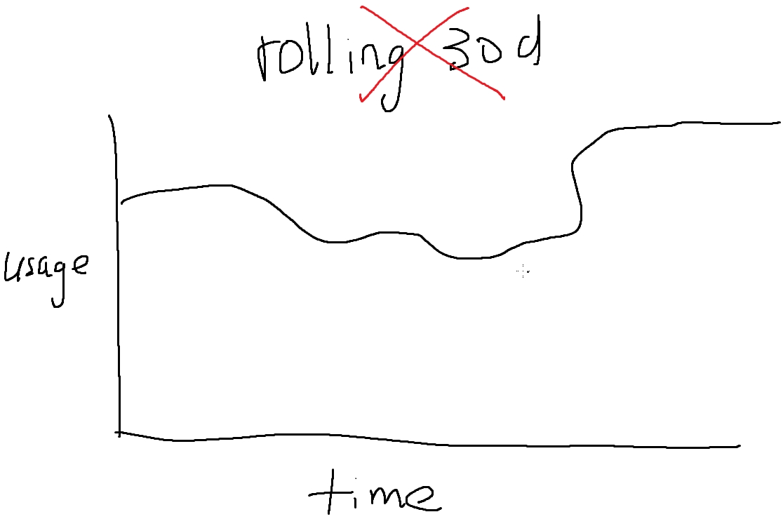
Monthly usage for GPU, CPU and RAM can be queried in Prometheus but the graph produced is not intuitive as it will mostly likely produce a rolling 30d window whereby every data point is the total from 30d earlier. While this can be useful to track changes in resource usage per month, it is not particularly useful for any who want to track usage within the month to see how much resources they're using.
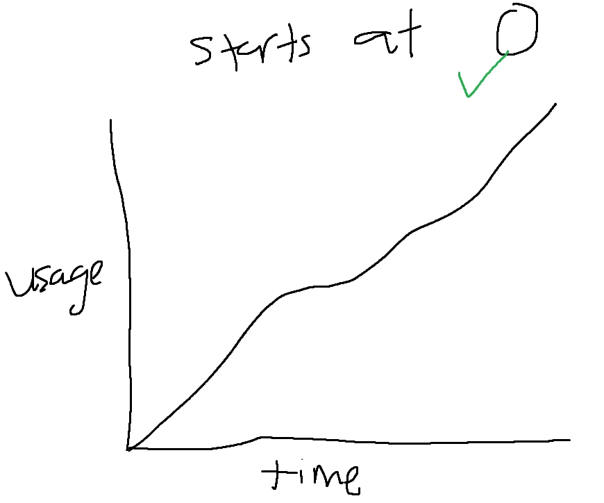
Intuitively we want a solution that shows the month-to-date increases in resource usage and we want to bound the beginning of the month to zero as a sort of starting point. To do this, we can use the in built Grafana Transformations specifically the Cumulative Sum Transform whilst querying with the $__interval parameter so that the cumulative function does not over count every data point. The result is something like this:
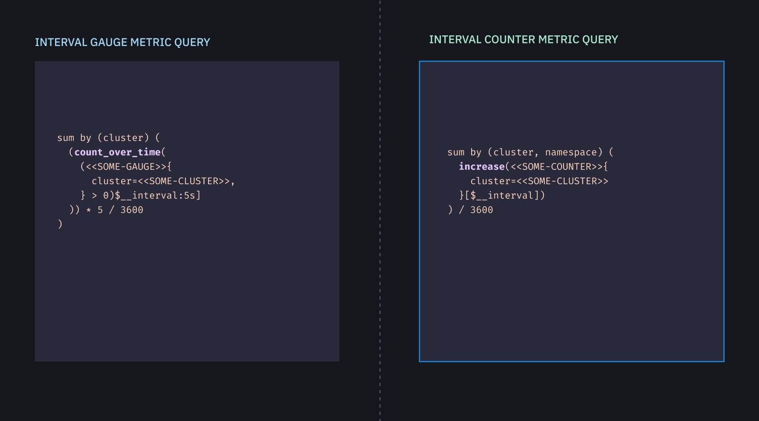
The solution is something like this:

And for counter metrics:
Existing Issues and Limitations
Window sizing (max data points) causes inconsistencies with the cumulative transform can cause the values of the cumulative transform and the values of the actual $__range query to diverge by around in my testing around +/- 10% in the worst cases. It happens only in quite rare circumstances where the data is not quite granular enough to get an accurate cumulative summation.
TLDR
A trick with Grafana Transforms along with PromQL queries in order to transform your summation query graphs from a rolling chart, where every point is the summation of the entire metric in the specified interval in the past, into a chart which is bounded to zero at the start in order to understand the chart more intuitively.